

The Unexpected Red Theory
Just something about it.

The "Unexpected Red Theory" is a concept making waves. Adding a touch of red to a room — especially where it's least expected — instantly makes the space feel more cohesive, fresh, and vibrant. The tiniest accent of red prevents a cool-toned palette from appearing flat. And the more random and unexpected the placement, the better.
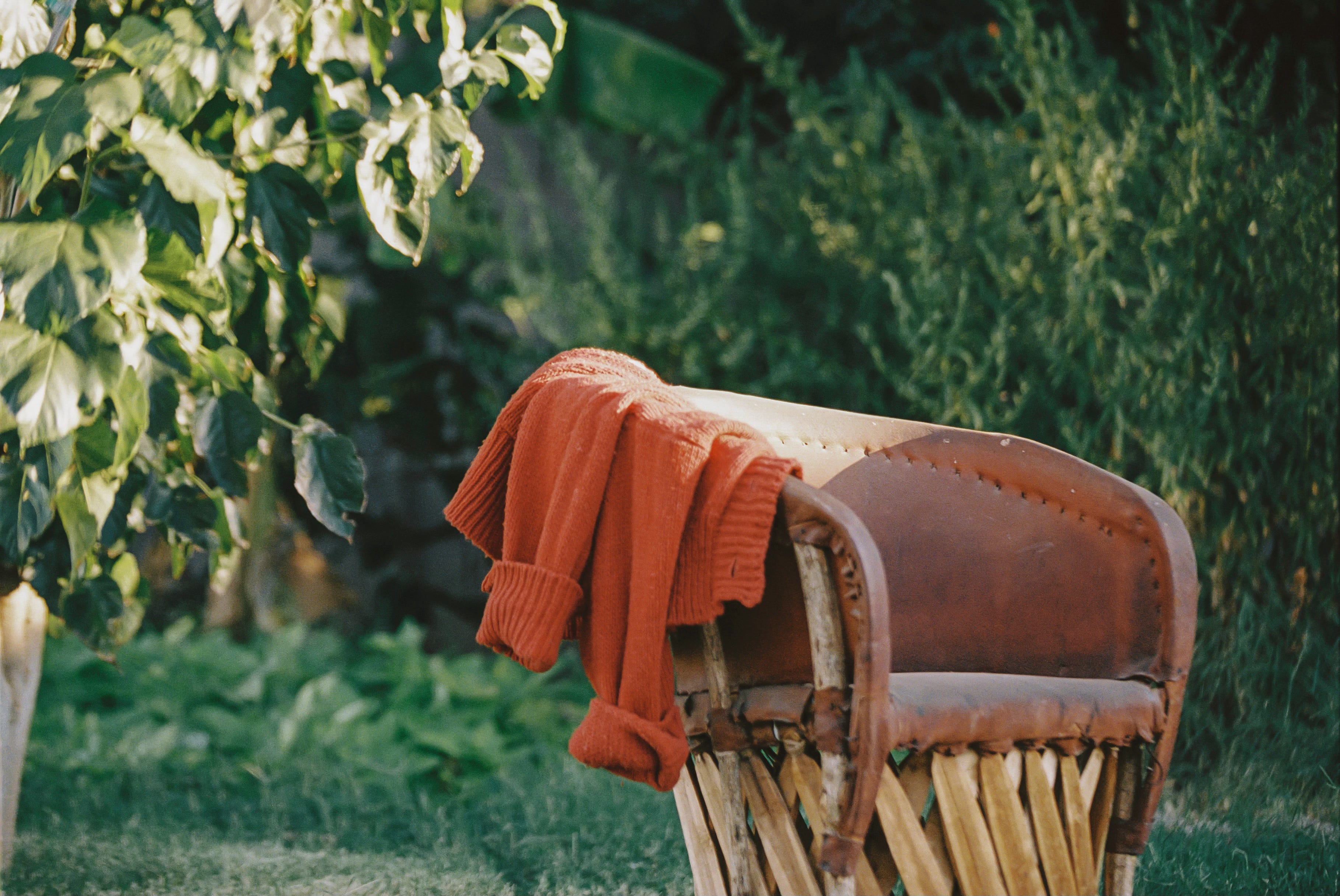
This idea isn't confined to interior design; it extends to spatial art and fashion. It's why I'm so drawn to my tomato-red Babaa sweater or my newly found leather Dooney & Bourke purse on Depop — it reminds me of the one my mom had when I was growing up. Red is familiar and bold, sensual to the eye yet striking to the senses. Like ruby red lips paired with an all-black dress, that "pop" offers something inexplicably lusty and desirable.
But it's funny this concept has recently been dubbed a trend (my least favorite word). Color theory has always been central to quality design and visual appeal, and this idea is no exception. Red has always been a foundational color.
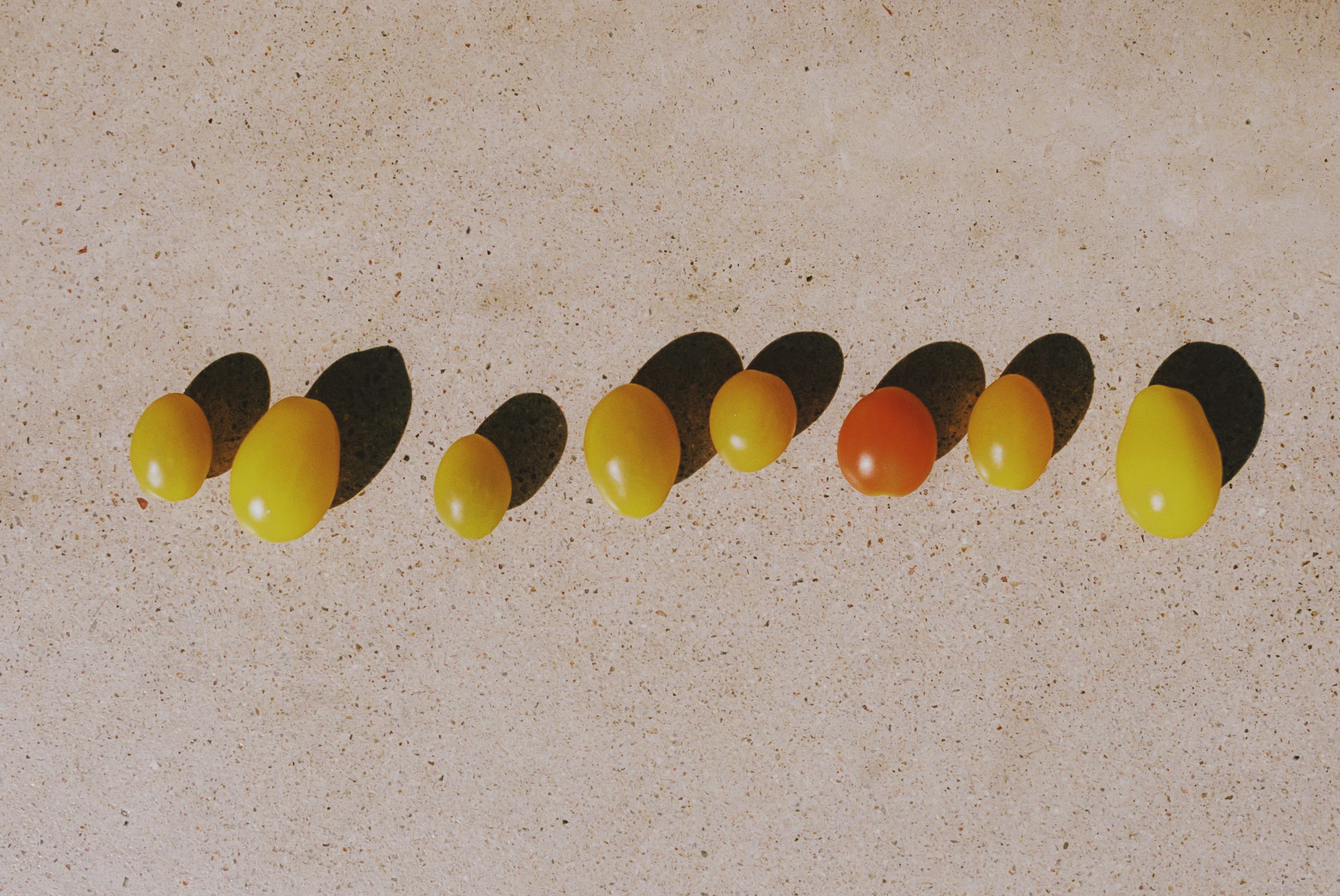
Red dresses are sexy.
Red lips are kissable.
Red shoes are iconic.
Red pillows are bold.
Red vases are loud.
Red is love, fire, passion, and romance.
And when love hits us in the face unexpectedly, we want more.


The World Is Turning Gray
White cabinets and colorless apartments have become life's default setting. It's no accident — it's by design. Neutrals are the crowd-pleasers that offend no one; they boost resale value and offer a safe middle ground between different tastes. They're the market's predictable peach. And this beige wave isn't confined to interiors — we see it in fashion, Instagram feeds, water bottle designs, and even children's toys.
Simplicity feels clean, but sometimes it feels a bit too clean — sterile. Free from clutter but stripped of character, musings, and warmth. There's a stark difference between living with less and living with intention. Intentionality invites thoughtful curation and purpose, while bare minimalism just leaves us craving more in spaces that offer less.
It's interesting how bold, saturated colors can physically jolt our senses, upping our energy and grabbing our attention, but they’re the least purchased or the last choice. Unsurprisingly, folks working in more alive, colorful offices feel more alert, confident, and even friendlier than those boxed into flat, gray spaces. That, or maybe it’s the $900 espresso machines. Either way. You get the point.
Chalking up our grayscale world to mere preference misses the bigger picture. This shift toward monochrome isn't just a style choice; it's a side effect of mass-produced materials and long-term systematic globalization. As plastics and stainless steel took center stage and wood fell by the wayside, consumer products' color palettes dulled in unison. Ironic that during an age where we can produce any color under the sun — particularly in the advent of the Industrial Revolution, which unleashed a rainbow of new pigments — we're settling for shades of gray.
Maybe it's a cocktail of practicality, best-selling aesthetics, and a deep-down craving for simplicity in our cluttered, over-stimulated lives. White and tans are soothing, familiar, and healing.
Are we subconsciously dialing down our surroundings to find calm amid the chaos?


Trend? Theory? Who Cares... It Looks Good
Look at a color wheel, and you'll notice how various color combinations stand out against each other. Turquoise and red are complementary, while red, purple, and pink are analogous. Red is typically an uplifting color, but you could also apply the same effect using hues of yellow, orange, or even purple (purple flowers look gorgeous in any room, by the way).
Some posit that the TikTok theory's popularity is proportional to how underutilized the hue has been in the past. It's less of a color theory moment and more than red; it has been trending for quite a long time; thus, its resurgence begs for analysis.
Don't Over-Do It
When done correctly, red can be sophisticated and playful, but you can't just throw a striped red pillow and call it good. It has to be an exciting addition to your room's composition and have an intention behind it. The same goes for fashion — red earrings with a blue jeans outfit or a ruby red-speckled art piece above the fireplace when the living room is dressed in neutrals.
Tastefully curated and just slight enough to strike intrigue.


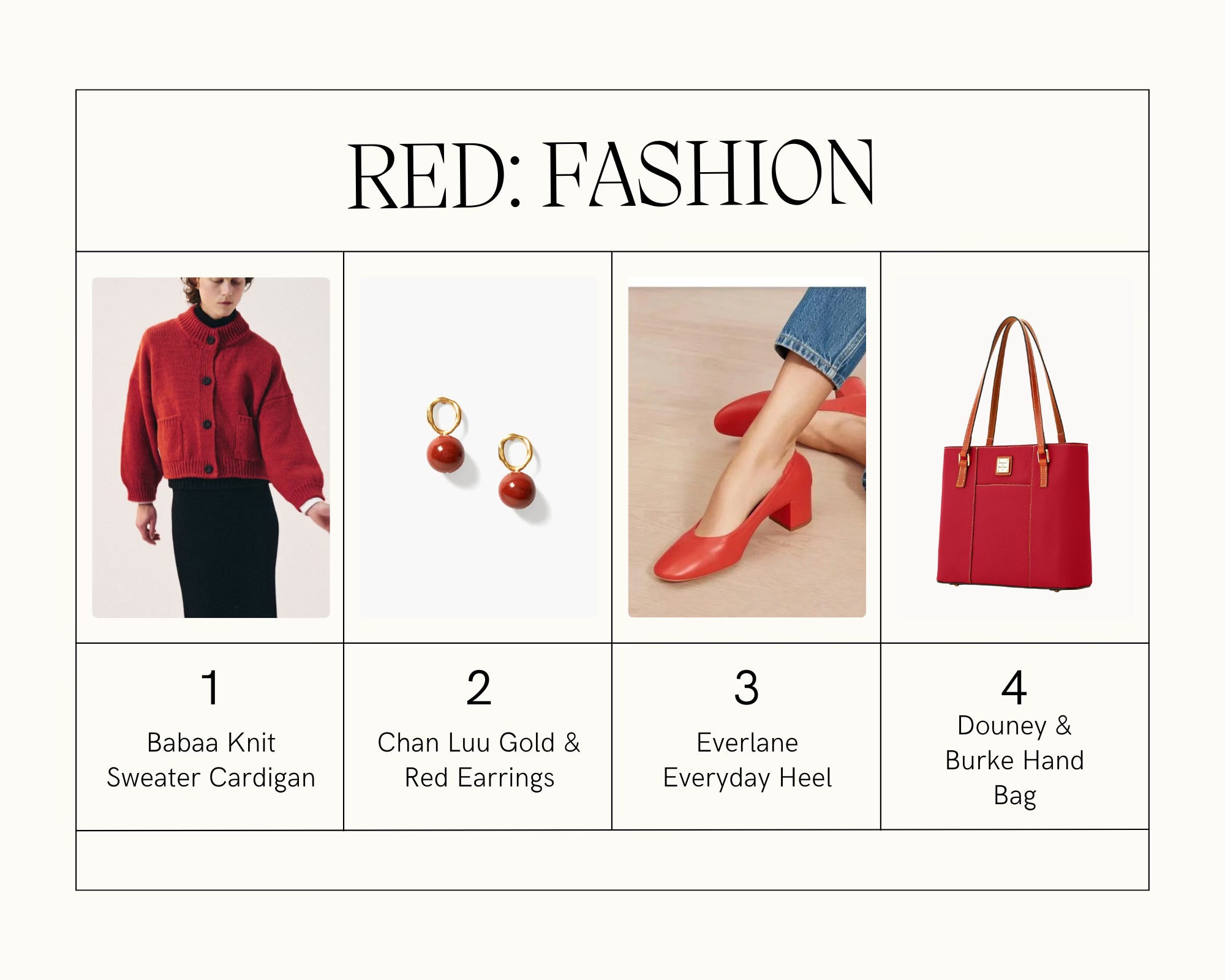
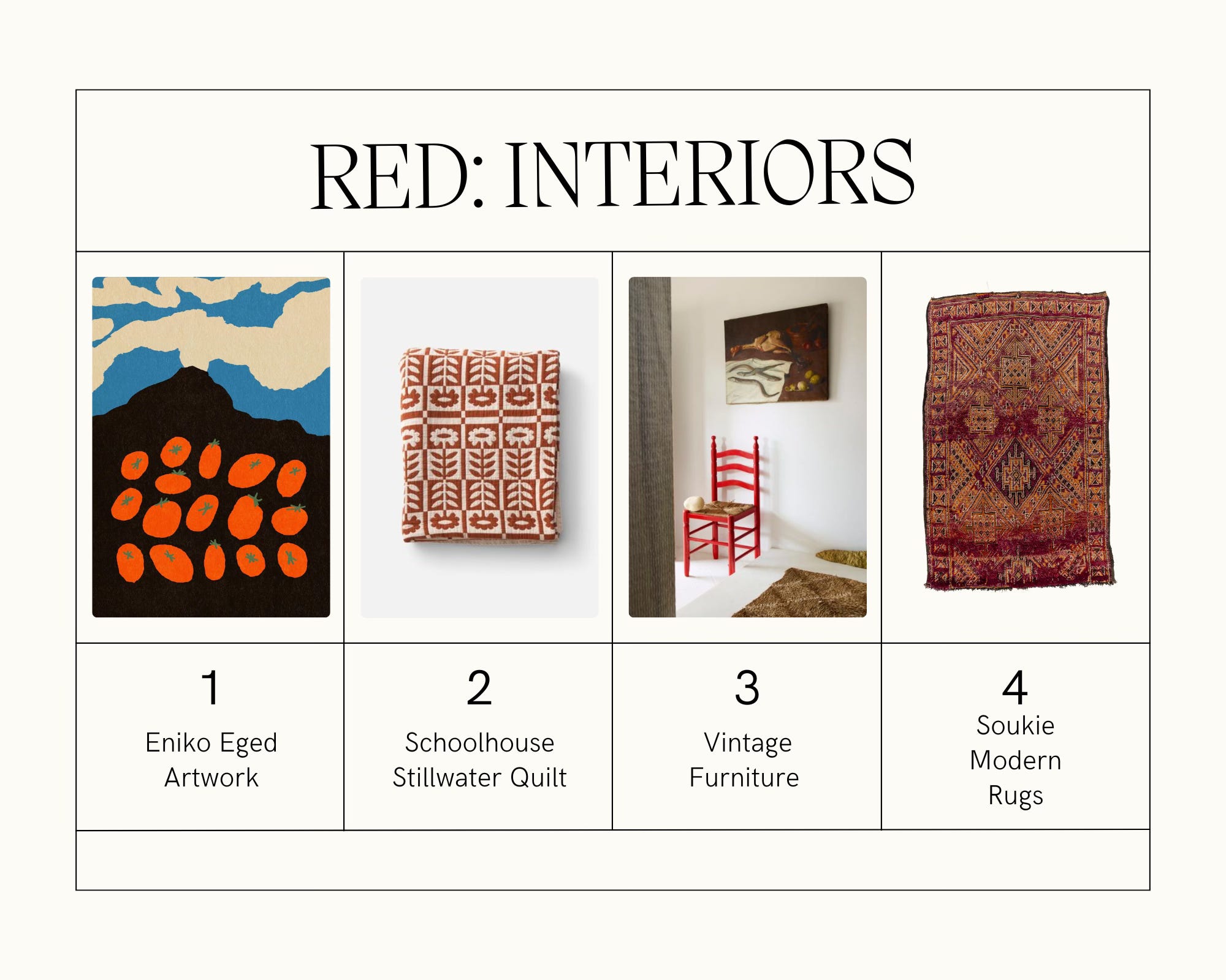
My Favorite Red Items...
This wouldn't be a Sunporch Newsletter without a fun listicle. Below are a few of my favorite pieces I’d like to share because why the hell not? Can we please claim red back as a fun, good color again?!
Everlane everyday heel.
Any rug from Soukie Modern.
The terracotta quilt from Schoolhouse.
Art from Eniko Eged or Shaskia.
Leather bags from Dooney and Bourke.
Tom Ford Lost Cherry perfume.